Case Study
Law Firm Name Change Needs New Logo, Website and Print Materials
For this logo, the law firm was undergoing a name change as well as building a new website. We settled on a design with the client, and through two rounds of revisions, we made adjustments to ensure that it fit the firm's colors and brand. We then applied the logo to a redesigned website, as well as print materials such as business cards, letterheads, and client folders.
Understanding the Client's Needs
Our clients were changing the name of their firm from Robbins, Strunk & Cramer to Cramer + Martinez, and they needed a completely new logo. We began the logo design process by speaking with the clients to determine what they did and did not like about their previous logo, the message they wanted their logo to convey, and the ways they were planning to use their new logo.
Initial Logo Designs and First Round of Revisions
We presented a set of several possible logo designs based on our discussions with the clients, giving them an idea of their options. The clients then provided feedback on what they liked best about these designs and which options they wanted to pursue. They selected elements, fonts, and icons from a variety of options and we moved to the second round.
Narrowing Down the Options Through the Second Round of Revisions
Based on the clients' feedback, we moved forward with the designs they found most appealing, incorporating color to fit their firm's branding and making the adjustments they requested. We then presented the clients with the second set of logo designs and got their feedback on these options.
Finalizing the Logo Design in the Third Round of Revisions
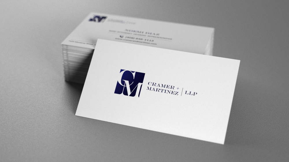
Incorporating the client's wishes, we narrowed the logo designs down to two options and finalized the colors that would be used. After the client made their final choice of the logo they wanted to use, we assisted with adding this logo to their website and designing print materials that incorporated the logo design and the firm's branding.


